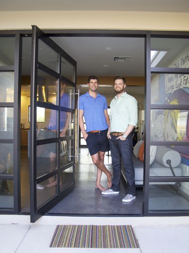
Cool home: Brothers turn Scottsdale eyesore into modern showpiece
From The Arizona Republic – September 22, 2016
Andrea Galyean, Special for The Republic
THE REPUBLIC | AZCENTRAL.COM
Would you let your brother decorate your house? How about giving him free rein over a complete down-to-the-studs renovation?
If your brother is Justin Nee, it would be an excellent idea.
Justin is an interior designer and he and his brother Brandon, who runs a school tuition organization, were sharing an apartment in Tempe back in 2009 when, tempted by the historically-low housing prices, they decided to buy a place together.
They liked South Scottsdale, so they agreed to look for a small house in that area, preferably a fixer-upper they could make their own.
“There were so many houses on the market back then, but we didn’t want something that had already been fixed up with a generic remodel,” Brandon explained. “Because then we’d end up ripping everything out but we’d still have to pay for it.”
The Nees looked at nearly 50 houses, searching for something with the right amount of unrealized potential.
Their realtor suggested an especially shabby property in the historic Hy-View neighborhood, but the brothers passed it up twice. But after an offer on a less run-down house fell through, they gave the Hy-View place another look.
This time, looking past the boarded-up windows, the derelict trailer in the side yard, the water-logged drywall, and the plastic stapled over damaged sections of ceiling, the Nees could see that the structure of the house was intact. At 1,500 square feet, it was the right size. They considered the location on a quiet cul-de-sac with views of Papago Park. And they decided maybe they’d found their house after all.
By the time the sale was finalized, Justin had a rough plan sketched out and contractors ready to go. For three months, the cul-de-sac was filled with trucks, dumpsters, and the sounds of jackhammers and drills.
The brothers were afraid that the neighbors — many of whom had been there since the mid-60s — would be unhappy about the commotion.
Instead, the 80-year-old woman next door brought over home-cooked lunches for the carpenters and electricians. Other neighbors, relieved that the eyesore was being rehabilitated, came with words of praise — and gratitude.
“As soon as we started tearing things out, neighbors would stop by and say: ‘It looks great!'” Brandon remembered. “That was before we’d even done anything.”
But reconstruction started quickly. The former carport became a sleek two-car garage — with a third bay tucked into the side yard to accommodate Brandon’s car hobby.
After the structural renovations were done, Justin really got to work. As a professional designer, he usually had to defer to his clients’ wishes, so he relished the opportunity to follow his own muse.
And Brandon?
“I saw it as a launch pad for Justin’s design work, so I just wanted to support his vision,” he said.
The brothers’ tastes are similar, but not identical.
“Brandon likes clean, modern lines, a very mid-century kind of look,” Justin said. “And I’m a little more eclectic, so I prefer to mix it up.”
Still, Brandon made a few decorating suggestions, albeit tentatively.
“When you know he has better taste than you, you just float an idea and see if he says it’s cool or it’s trash,” Brandon said. “And if he says it’s cool, then you say: ‘Yeah, I knew that.'”
The biggest design challenges were maximizing the light and space in what was still a compact home. Justin devised creative solutions for the small bedrooms and bathrooms like installing a pocket door on the linen closet, building the master bedroom’s headboard into the wall, and covering the bathrooms with glass tiles to reflect light and make the rooms feel larger.
However, unlike some of Justin’s clients, the brothers had a limited budget, which they maximized by relying on good design and local craftspeople.
They used Ikea for the bedroom closets because, Justin admitted, “You really can’t beat their organizational systems.”
But the shelving and doors are fitted into specially-built nooks, which save space while looking custom. Throughout the house, Justin upgraded standard items with little touches like the modernist horizontal lines he had routed into ordinary interior doors.
The kitchen cabinets and counters, however, were made to order, as were the exposed shelving units in the foyer.
These areas, Justin said, are places it’s worth splurging because they set the style for the home, so quality craftsmanship shows.
The furnishings, too, have a personal touch.
“Almost everything was either commissioned or given to us or means something,” Brandon said.
Their mother’s baby-grand piano and their grandfather’s old military chest mix with bold and playful paintings purchased from local artists and friends.
The resulting home combines a mid-century layout with contemporary touches like polished concrete floors and oversized windows — as well as less obvious improvements like new plumbing and electrical systems.
And the neighbors are still pleased. The house was even a featured stop on Scottsdale’s Innovations MOD Home Tour in January 2016.
In retrospect, Brandon likens the process to restoring a vintage car.
“When you remodel, it’s tempting to just cover up the old stuff, but you have to do it right, even the not-sexy parts,” he said. “The trick is how do you be fair to the original but update it with modern conveniences?”
To answer that question, just ask your brother.

